


Big HomeScreen - Easy & Smooth
4.520.00 Reviews
App Specs
- Version
- 1.1.2
- Updated On
- License
- Free
- Downloads
- 10,000+
- Developer
- ICC Tech
- Categories
- Personalization
- Platform
- Android
Screenshots
 Analysis by AppCompare
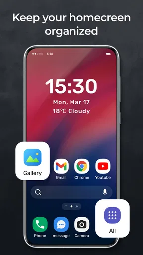
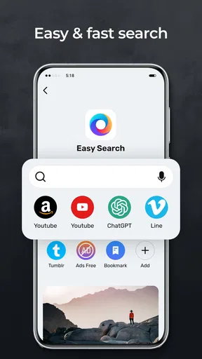
I approached Big HomeScreen - Easy & Smooth as a practical personalization app rather than just another way to change an icon grid. Its purpose is clear from the first impression: it wants the home screen to feel more comfortable to use, especially when the standard launcher makes everything look cramped or difficult to read. That focus makes it interesting for people who want a calmer Android starting point without turning their phone into a complicated customization project.
My overall impression is positive, but with an important qualification. This is the kind of launcher experience that should be judged by everyday comfort, not by a long list of flashy extras. The developer, ICC Tech, presents it as something broader than a basic launcher, while the short store description, “Big HomeScreen,” points toward its main appeal: making the home screen feel larger and easier to navigate. I found that idea more useful than it may sound, particularly for users who regularly miss small icons, struggle with crowded layouts, or simply prefer a more spacious first screen.
A larger home screen changes the way the phone feels
The first thing I would consider before installing it is not whether it replaces every launcher feature you already know. I would ask whether the default home screen is getting in your way. If you often open the wrong app because icons sit too close together, or if you need to look carefully before recognizing what is on screen, a launcher built around a larger presentation can solve a very specific daily annoyance.
That makes the app especially relevant for older family members, people with less comfortable eyesight, users who prefer simple layouts, and anyone who wants fewer visual distractions. It can also suit a secondary phone used for calls, messages, maps, banking, or a handful of essential tools. In that situation, a wide, readable starting point may be more valuable than elaborate themes or an endless collection of widgets.
I would not install it expecting a complete replacement for every advanced launcher workflow. People who enjoy building intricate gesture systems, arranging several dense pages, or fine-tuning every visual detail may find the larger approach restrictive. The app’s identity is strongest when the goal is clarity. It is less convincing if your idea of personalization means squeezing as much information as possible onto one display.
What the “easy and smooth” promise means in practice
With a launcher, perceived speed is not only about how quickly an app opens. It is also about how quickly I can understand the screen, find the right icon, and return to a familiar place without hesitation. A less crowded layout can make the phone feel faster even when the underlying hardware has not changed, because there is less visual searching between actions.
That distinction matters here. Big HomeScreen - Easy & Smooth is best understood as a usability layer over Android rather than a performance booster for every part of the device. It can make the route to common apps feel more direct, but it cannot turn a slow phone into a fast one. If an application takes time to load because of the phone, the launcher does not remove that wait.
Worth Reading Before You Choose

Flipboard Shows What News Apps Must Do Beyond the Feed

Switching to Android Auto Means Rethinking Your Driving Routine
Google Calendar Makes a Crowded Week Easier to Manage

Ludo King Makes the Most of the Minutes Between Plans

Baby Panda World Brings Quick Play to Modern Phones, but Its Game Library Feels Busy

ESPN’s Live Game View Makes Following Close Games Easier
I also appreciate that the app is free. There is no purchase decision standing between a user and the basic experiment of trying a different home screen. The age rating is Everyone, which matches the straightforward nature of the product and makes it a reasonable candidate for a shared household device. The current version is 1.1.2, so I would still approach it as a relatively focused tool rather than a mature platform with years of accumulated options.
How I would set it up for a real daily routine
My advice is to begin with the apps you reach for without thinking. Put communication, camera, maps, and any essential work or health tools where they are easiest to recognize. Do not try to recreate every page from the previous launcher on the first attempt. The benefit of a larger home screen is quickly weakened if it becomes a crowded copy of the old one.
A useful test is to use the phone at three different moments: while standing outside, when the room is poorly lit, and when you are in a hurry. Those situations reveal whether the design is genuinely easier to read or merely looks spacious during setup. If you can identify the correct app without pausing, the launcher is doing its job. If you still need to scan several similar icons, the extra size may not be enough on its own.
There is also a practical migration issue. Changing launchers affects a habit that is repeated dozens of times a day, so the first hours can feel slower simply because the arrangement is unfamiliar. I would keep the initial layout deliberately simple and avoid changing it repeatedly. A stable arrangement gives the brain time to build a new memory of where things are.
Heavy-use moments reveal the real trade-off
The most demanding test for a launcher is not a single tap. It is a long day of opening and closing applications, returning to the home screen, checking notifications, and moving between several common tasks. During that kind of use, the launcher needs to remain predictable. A home screen that looks attractive but makes me stop and search each time is not actually efficient.
For a person who uses only a modest set of apps, the larger presentation should be easy to appreciate. A parent checking messages, opening the camera, and starting navigation does not need a dense dashboard. The same is true for a work phone where a few tools matter more than a large catalog of shortcuts. In these cases, the app’s simplicity can reduce the small decisions that make a phone feel tiring.
The trade-off appears when the phone becomes an information hub. If you depend on many widgets, several app pages, frequent shortcuts, or a carefully organized productivity layout, a bigger home screen may use space less efficiently. You may gain readability but lose at-a-glance information. That is not a flaw for every user; it is a question of which resource matters more to you: visual comfort or information density.
I would also be cautious about judging smoothness from the first few minutes. A launcher can feel immediate during a short test but become less convenient when the home screen is filled with personal shortcuts and the user is switching rapidly between apps. Since the available product information does not provide hardware benchmarks or resource measurements, I would not claim a specific memory footprint or battery effect. My practical recommendation is to watch the phone over a normal day rather than relying on a quick setup impression.
Stability matters more than decoration
A launcher sits at the center of the Android experience, so reliability is more important here than it is for a casual wallpaper app. If the home screen does not appear correctly, if returning home feels inconsistent, or if the arrangement is difficult to recover after a problem, even a good visual concept becomes frustrating. That is why I would treat the app’s recovery behavior as part of the installation decision.
Before moving all my shortcuts, I would spend some time opening the apps I use most and returning home repeatedly. I would also make sure I know how to switch back to the phone’s previous launcher through Android settings. That is not a criticism unique to this product; it is sensible preparation whenever a launcher becomes the main entry point to the device. It gives me a clear exit if the layout does not suit my habits.
For a family member, I would do this setup with them rather than simply installing it remotely. A larger home screen can be helpful, but the person using it should recognize the arrangement and know what to do if an icon moves or the default home-screen choice changes. A short orientation session is more valuable than adding a large number of shortcuts at once.
The app’s rating is a 4.5 average from over 160 ratings, with 20 written reviews, and it has passed 10 thousand installs. Those figures suggest that other users have found enough value to leave favorable feedback, but I would not treat them as proof that every phone will behave identically. Launcher performance and comfort are unusually personal: screen size, Android configuration, eyesight, habits, and the number of installed apps all affect the result.
Older phones and minimum requirements
Big HomeScreen - Easy & Smooth supports Android 8.0 and newer. That gives it a useful reach across older devices, but compatibility alone does not guarantee the same experience on every model. An older phone may have a smaller display, less responsive touch hardware, or limited system resources. Those factors can influence how pleasant any launcher feels, regardless of how simple its layout is.
If your device is aging, I would pay close attention to three things after installation: how quickly the home screen appears after unlocking, whether returning home feels consistent after several app switches, and whether the phone remains comfortable during a full day. These are more meaningful checks than judging the app by its installation screen. If the launcher is easy to read but the device still pauses during ordinary navigation, the bottleneck is probably elsewhere.
On a newer phone, the question changes. You may have enough power for a highly customizable launcher, so the reason to choose this one becomes comfort rather than necessity. It can still be worthwhile if you dislike tiny icons or want a cleaner first screen, but you should not expect it to unlock capabilities that a feature-heavy alternative already provides.
Resource-conscious users should also keep expectations realistic. The app’s store summary describes it as more than just a launcher, but that phrase does not by itself establish how much background activity, storage, memory, or battery it uses. I would avoid promising savings or claiming a particular impact. Instead, compare your phone’s normal behavior before and after installation, especially if battery life is already a concern.
Where it beats the usual launcher alternatives
The default Android launcher usually wins on familiarity and integration. It is already configured, and most users can begin without learning a new arrangement. A conventional third-party launcher often wins on customization, offering more ways to adjust icons, gestures, grids, and pages. Big HomeScreen - Easy & Smooth occupies a different position: it is appealing when the standard layout feels too small and a highly configurable replacement feels like unnecessary work.
That middle ground is its strongest practical advantage. I would recommend it over a dense customization launcher to someone who wants a more readable home screen but does not want to spend an evening tuning every setting. I would recommend the default launcher instead to someone who is satisfied with the current layout and sees no accessibility or comfort problem. There is little reason to change a familiar system merely for the sake of changing it.
I would choose a more advanced alternative for a power user who relies on complex gestures, extensive widget dashboards, multiple profiles, or precise visual control. The larger design philosophy may make those workflows feel less efficient. Conversely, I would choose this app for a simple household phone where recognition and confidence matter more than squeezing in every available shortcut.
Small workflow improvements that are easy to miss
One useful way to think about the app is as a decision filter. Instead of asking which apps deserve a place on the home screen, ask which actions must be easy to start without searching. That usually produces a better layout than copying the entire app drawer. Keeping only the actions that matter in stressful moments—calling a contact, opening navigation, checking messages, or taking a photo—can make the larger screen feel purposeful rather than merely oversized.
A second tip is to separate “recognition” from “frequency.” The app you open most often is not always the one that needs the clearest position. An emergency contact, a transit tool, or a medical app may be used less frequently but should be instantly identifiable when needed. A spacious launcher gives you room to prioritize those situations instead of organizing everything only by daily repetition.
A third trade-off involves shared devices. On a personal phone, I can adapt to a new arrangement quickly. On a family device, consistency matters more than personal taste. I would create a layout with obvious labels or recognizable positions and then avoid changing it casually. The simpler the arrangement, the easier it is for another person to build confidence using the phone without calling for help every time an icon is moved.
There is a fourth consideration for people who frequently switch between work and personal tasks. A large home screen can reduce the visual clutter of a mixed app collection, but it may also encourage you to keep too many “just in case” shortcuts visible. I would use the main screen for immediate actions and leave occasional tools elsewhere. That preserves the app’s central advantage instead of turning it into another crowded launcher.
Who should install it, and who should skip it
I think this app is a good fit for someone who finds ordinary Android layouts cramped, wants a free way to test a more readable home screen, or is setting up a phone for a person who values simplicity. It also makes sense for users who care more about comfortable access than about building a highly personalized visual system. The Everyone rating and Android 8.0 minimum make it approachable for a broad range of devices and users.
I would skip it if your current launcher already feels clear and fast, especially if you depend on a dense widget arrangement or advanced customization. I would also hesitate if you are looking for a tool that will improve the speed of demanding applications, extend battery life, or solve general device slowdowns. A launcher can change the starting point of the phone; it cannot repair every performance problem underneath it.
For anyone worried about being stuck with the new layout, I would install it as a trial rather than immediately rebuilding the entire phone around it. Use it for routine tasks, keep the previous launcher available, and decide after the novelty has worn off. That approach answers the important questions—comfort, responsiveness, and reliability—without making the switch feel risky.
My performance verdict
Big HomeScreen - Easy & Smooth succeeds when “smooth” means fewer visual obstacles and “big” means easier recognition of the apps that matter. Its strongest contribution is not a promise of faster hardware; it is a more deliberate starting point for everyday phone use. For the right person, that can make the device feel quicker because less time is spent searching and correcting taps.
I would describe it as a focused personalization choice from ICC Tech, not a universal replacement for every Android launcher. The free price makes experimentation easy, and the positive 4.5 average gives it a reassuring first impression, while the modest install base means I would still make the final decision through personal testing rather than popularity alone. The current 1.1.2 release is worth trying if readability and simplicity are your priorities.
My recommendation is to choose it for comfort, not for benchmark performance. Give it a deliberately small set of important apps, test it during real busy moments, and keep an exit route until you are confident. If your phone feels easier to understand and just as dependable after normal use, the larger home screen is doing exactly what it should. If you miss dense information or advanced controls, the standard launcher or a more configurable alternative will probably serve you better.
Pros
- Simple layout makes essential apps easy to find quickly.
- Smooth navigation feels responsive on compatible devices.
- Useful for users who prefer a less cluttered home screen.
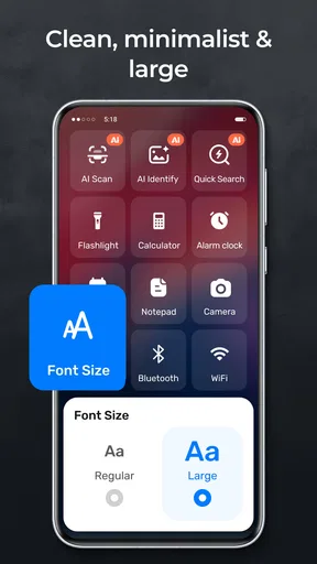
- Large visual elements improve readability at a glance.
- Can make older or less powerful phones feel easier to use.
Cons
- Customization options may feel limited for advanced users.
- Large icons can reduce the number of apps visible at once.
- Some features may require adjustment before feeling intuitive.
- The design may not suit users who prefer a traditional launcher.
- Performance and compatibility can vary across Android devices.
FAQs for Big HomeScreen - Easy & Smooth
What is Big HomeScreen - Easy & Smooth, and who is it designed for?
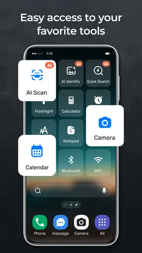
Big HomeScreen - Easy & Smooth is an Android launcher focused on simplicity, readability, and easier navigation. It replaces the standard home screen with a cleaner layout featuring larger visual elements and straightforward access to essential functions. It may be especially useful for older adults, users with limited vision, or anyone who finds conventional launchers crowded and difficult to use.
Does Big HomeScreen - Easy & Smooth make the phone easier to use?
The launcher is designed to reduce the number of steps needed to reach commonly used apps and phone functions. Larger icons, clearer labels, and a less complicated layout can make everyday navigation more comfortable. However, the experience still depends on the phone model, Android version, and how the home screen is configured, so users should spend a few minutes adjusting the available options after installation.
Can I customize the home screen, icons, and shortcuts?
Big HomeScreen - Easy & Smooth generally focuses on practical customization rather than advanced visual themes. Depending on the version installed, you may be able to choose which applications and shortcuts appear, adjust the layout, and modify certain display preferences. It is worth checking the launcher’s settings carefully, because some customization options may be limited compared with feature-rich launchers intended for experienced Android users.
Will installing Big HomeScreen - Easy & Smooth delete my apps or change my phone permanently?
Installing the launcher should not remove your applications, photos, contacts, or personal files. It works as an alternative home-screen interface, and Android normally lets you switch back to the manufacturer’s default launcher through the system settings. Before making it the permanent default, it is sensible to test it first and confirm that important shortcuts, widgets, notifications, and accessibility features work as expected.
Is Big HomeScreen - Easy & Smooth free, and what permissions should I review?
Availability and pricing can vary by region and by the version listed in the Google Play Store. Before downloading, review the current store description for advertising, in-app purchases, and subscription information. Also check the requested permissions and privacy details. A launcher may need access related to displaying apps or managing the home screen, but users should be cautious if permissions seem unrelated to its core purpose.


